In the world of music, the perception of a brand, artist or business, is strictly linked to the image that the main subject give to other. This is the case of Mixtape Monopoly, a marketing company in Atlanta, USA.
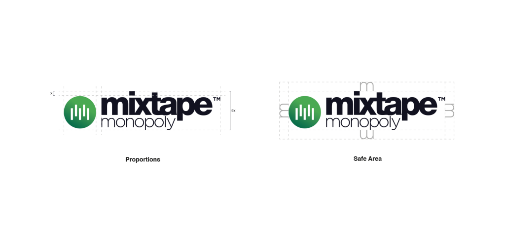
Music is the core business of this company. Previous versions of the Mixtape Monopoly logotype were far from this idea, and this didn’t give to people the right idea of the brand, because the company promote young artists into the music panorama every year. It’s been important to focus the attention on the music aspect. In doing so, the new logotype is inspired by underground culture, but also by corporate world.
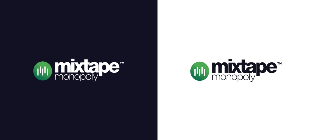
Mixtape Monopoly’s motto is “Catch the Wave”, and I choose to give a central role to it into the pictogram. It represents the sound wave, the shape that music made when it’s recorded. Also, the disposition of the elements that forms the wave it’s linked to the letter M, that is also the naming initial, and “Music” initial. A green gradient, inspired by music brands like Spotify and strictly linked to the first company color palette, complete the circle and gives to the brand a fresh touch.
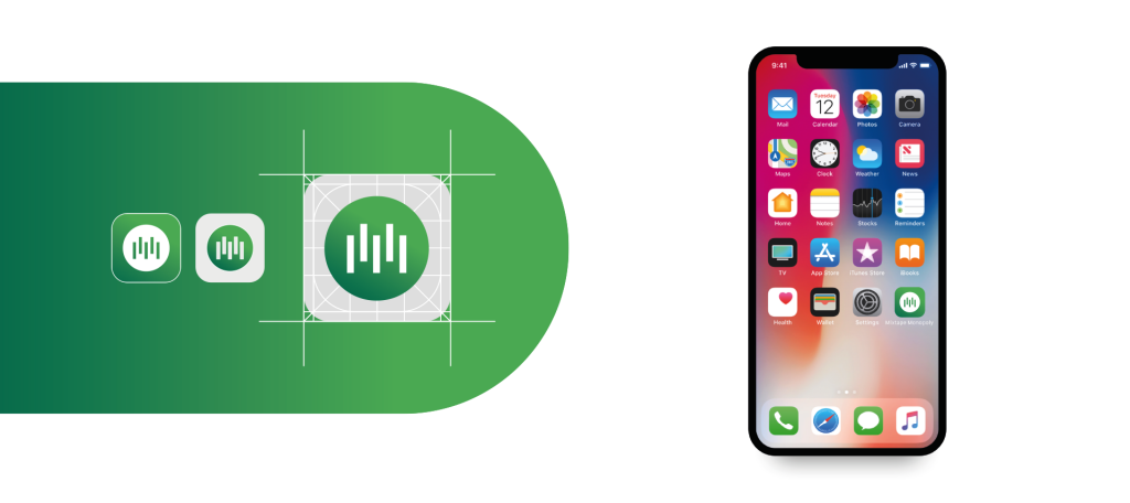
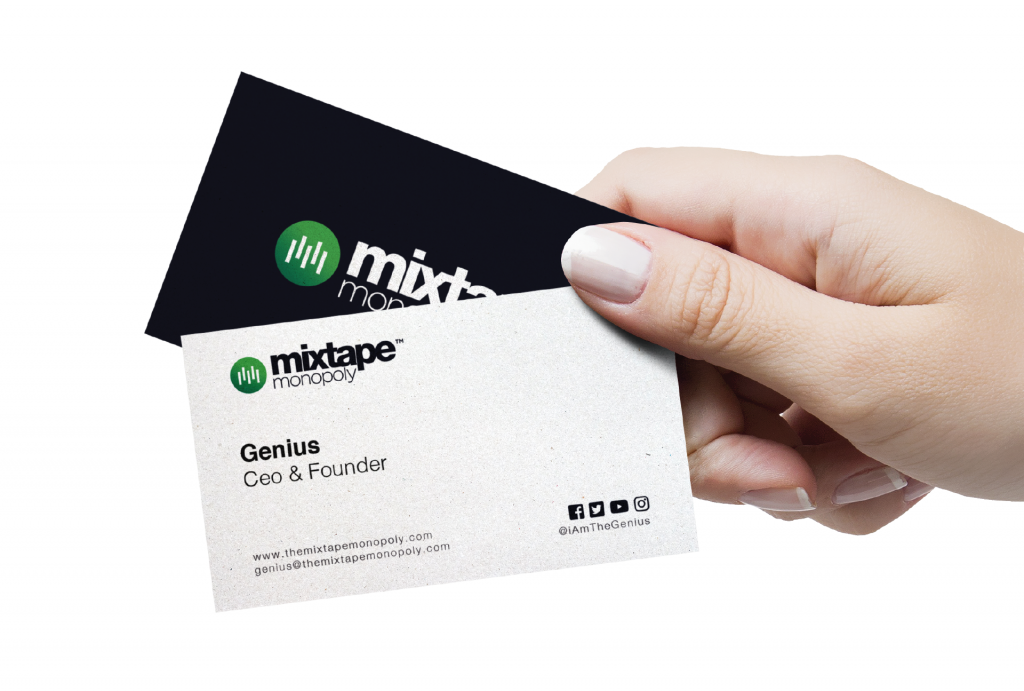
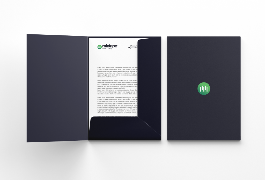
So, I made a complete brand identity, composed of business cards, letterhead and folders. The brand identity recalls the original color palette used for the logotype and has a minimal and clean approach. To finish the project I made a concept for an iOS app, using the Mixtape Monopoly pictogram alone for the icon, wich is very clean and minimal and keeps intact the idea of having an underground and corporate brand identity, and can be used alone to future application like, as we told previously, an application.
